CSS - 浮动 
作者:KK
发表日期:2016.1.26
左浮动 
网页上有很多区域在东南西北角搭配,其实主要都是通过浮动控制来实现的哦,这是很重要的排版技术!来来来
首先我要你了解一下如果不使用浮动的话HTML元素是怎么排版的:
<body>
<style type="text/css">
.content{width:400px; height:200px; background:green;}
.right{width:100px; height:200px; background:yellow;}
</style>
<div class="content">文章内容文章内容文章内容文章内容文章文章内容文章内容文章内容文章内容文章内容文章内容内容文章内容文章内容文章内容文章内容文章内容。...</div>
<div class="right">
	<p>右侧栏</p>
	<p>热点文章1</p>
	<p>热点文章2</p>
	<p>热点文章3</p>
	<p>热点文章4</p>
	<p><a href="#">联系我们</a></p>
</div>
</body>
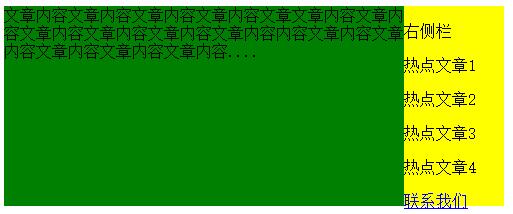
以上例子构造了两个div区域,一个.content用于显示主要内容,.right用于显示次要内容,但是它们只能上下排版,你有没有想过,如果它们要一左一右排版又怎么办呢?那就要靠浮动控制咯
浮动的样式属性名称叫float,应用例子:
<body>
<style type="text/css">
.content{width:400px; height:200px; background:green;}
.right{width:100px; height:200px; background:yellow;}
.content,.right{float:left;} /*重点,这里让两个div都进行左浮动*/
</style>

<div class="content">文章内容文章内容文章内容文章内容文章文章内容文章内容文章内容文章内容文章内容文章内容内容文章内容文章内容文章内容文章内容文章内容。...</div>
<div class="right">
	<p>右侧栏</p>
	<p>热点文章1</p>
	<p>热点文章2</p>
	<p>热点文章3</p>
	<p>热点文章4</p>
	<p><a href="#">联系我们</a></p>
</div>
</body>
虽然不是很好看,但起码基本实现了一左一右排版了是不是?
清除浮动 
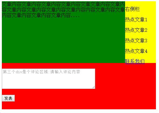
通常浮得太厉害页面会乱的哦!所以有了清除浮动的需求,比如我有三个div,只要前面2个左右排,第3个不再跟着排了,而是在下面重新起一行来排,你可不要以为加br标签就行了啊,不信你自己试试
清除浮动要用clear属性来实现,下面我弄个例子,第三个div就是清除了浮动的
<body>
<style type="text/css">
.content{width:400px; height:200px; background:green;}
.right{width:100px; height:200px; background:yellow;}
.content,.right{float:left;}
.comment{width:500px; height:150px; background:red; clear:both;} /*重点,这里使用了clear属性清除浮动/
</style>

<div class="content">文章内容文章内容文章内容文章内容文章文章内容文章内容文章内容文章内容文章内容文章内容内容文章内容文章内容文章内容文章内容文章内容。...</div>
<div class="right">
	<p>右侧栏</p>
	<p>热点文章1</p>
	<p>热点文章2</p>
	<p>热点文章3</p>
	<p>热点文章4</p>
	<p><a href="#">联系我们</a></p>
</div>
<div class="comment">
	<br />
	<textarea cols="40" rows="4" placeholder="第三个div是个评论区域:请输入评论内容"></textarea>
	<p><button type="button">发表</button></p>
</div>
</body>
效果图下:
右浮动 
右浮动和左浮动相反,前面的div先会靠到右边,后面的跟右它的左边排,就是从右到左排
通过设置float属性的值为right来实现,看看:
<body>
<style type="text/css">
div{width:300px; height:300px; float:right;}
.d1{background:red;}
.d2{background:yellow; color:rgb(0, 0, 255); font-weight:bold;}
.d3{background:blue; color:#FFF; font-weight:bold;}
</style>
<div class="d1">
	第一个区域,先排最右边<br/>
	反正三个从右到左排
</div>
<div class="d2">第二个区域,跟在第一个的左边</div>
<div class="d3">第三个区域,跟在第二个的左边</div>
</body>
应用实例 
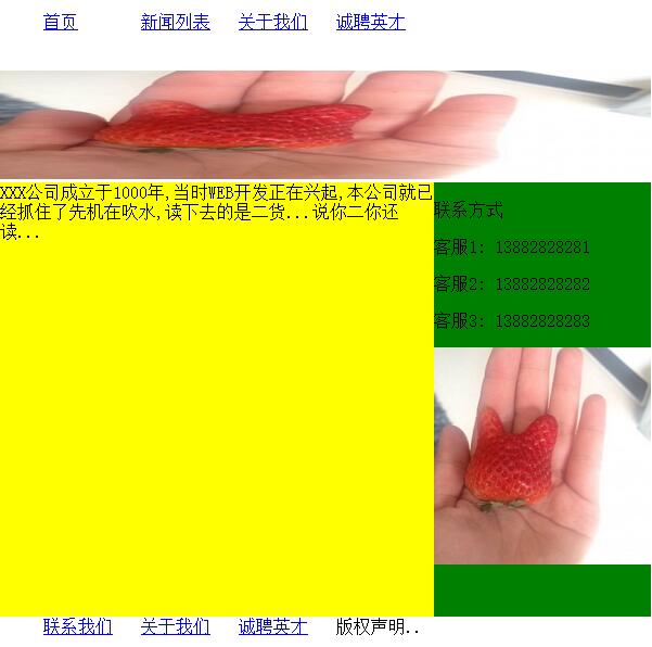
学会了浮动,这下就好办了,好多页面的轮廓排版都能做出来了,下面看我做个经典的网页排版出来:
<body>
<style type="text/css">
ul{list-style:none;}
.nav li,.footer li	{width:90px; float:left;}
.banner1,.footer{clear:both;}
.main .content{width:400px; height:400px; background:yellow;}
.main .right{width:200px; height:400px; background:green;}
.main .content,.main .right{float:left;}
</style>

<div class="nav">
	<ul>
		<li><a href="#">首页</a></li>
		<li><a href="#">新闻列表</a></li>
		<li><a href="#">关于我们</a></li>
		<li><a href="#">诚聘英才</a></li>
	</ul>
</div>

<br />
<br />
<br />

<div class="banner1"><!--广告位1-->
	<img width="600" height="100" src="http://www.kkh86.com/it/html-base/img/img-demo.jpg" />
</div>

<div class="main">
	<div class="content">XXX公司成立于1000年,当时WEB开发正在兴起,本公司就已经抓住了先机在吹水,读下去的是二货。.。说你二你还读。..</div>

	<div class="right">
		<div class="concact">
			<p class="title">联系方式</p>
			<p>客服1: 13882828281</p>
			<p>客服2: 13882828282</p>
			<p>客服3: 13882828283</p>
		</div>

		<div class="banner2"><!--广告位2-->
			<img width="200" height="200" src="http://www.kkh86.com/it/html-base/img/img-demo.jpg" />
		</div>
	</div>
</div>

<br />
<br />
<br />

<div class="footer">
	<ul>
		<li><a href="#">联系我们</a></li>
		<li><a href="#">关于我们</a></li>
		<li><a href="#">诚聘英才</a></li>
		<li>版权声明..</li>
	</ul>
</div>
</body>
效果图如下,自己多练习吧
新技术取代浮动:flex 
其实通过float控制浮动已经过时了,在兼容老式浏览器的时候还可以说得过去,但如果做的网页只是给新的浏览器用,那就应该用flex这个方案来做排版了,我暂时没有文章,请另外百度吧~暂时未有计划推出相关文章